Logos is a way of persuading an audience with reason, using facts and figures. A company logo is a symbol of your company’s identity. It creates your customers’ first impression of your company. The best logos send a message to customers about the company’s values, create brand loyalty and give company letterhead, vehicles and signs a more professional appearance.
Here are some of the most iconic logos of all time:-
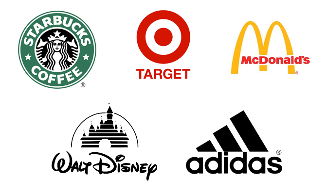
Starbucks
When Starbucks was getting started way back in 1971, they wanted to capture the seafaring history of coffee and Seattle’s strong seaport roots. They took their time did a lot research poring over old marine books. They eventually came across a 16th century Norse woodcut of a twin-tailed mermaid, or Siren. The seductive mystery mixed with a nautical theme that was exactly what the founders were looking for. A logo was designed around her, and our long relationship with the Siren began. Though they have now done away with the Starbucks name on their logo, we can easily recognize the world’s most popular café.
McDonald’s
The golden arches. Who doesn’t recognize that? The Golden Arches are the famous symbol of McDonald’s. It’s derived from their early architecture to be seen from afar, and now it’s incorporated into their branding. They were incorporated into the chain’s logo in 1962, when the current Golden Arches logo resembled an “M” for “McDonald’s”.
Apple
The Apple logo has always been prominent, but has grown over the years due to the rising popularity of Apple products. One of the most recognizable logos in the world, the Apple logo is theorized to have come from none other than the story of Adam and Eve. The apple is supposed to be the apple Eve bit from in the bible and represents the fruits from the Tree of Knowledge.
FedEx
As Dieter Rams said “Good design is as little design as possible.” FedEx is an incredibly popular shipping company, and its logo is plastered on trucks and planes all over. While there isn’t anything incredibly groundbreaking in the colors or simple type, there is a hidden gem in there. Have you ever noticed the arrow hidden in the negative space between the ‘E’ and ‘x’? The arrow represents the idea of moving forward with speed and precision, much like the FedEx brand.
Mercedes
Mercedes-Benz is the face of luxury cars. The triangle star represents the brand’s “dominance over land, air and sea”. It represents the automaker’s drive toward universal motorization with its engines dominating the land, sea, and air (three points). Mercedes Benz was used to produce planes for World War I in Germany. The logo may come from what the company said, but, history surely influenced it.
Pepsi
The famous cola drink brand was first launched in 1898, and has since evolved through the ages from a decorative scripted font to the red, white and blue globe that we see today. Pepsi unveiled a new bottle cap that featured the Pepsi script surrounded by red and blue colors on a white background. Since Pepsi was recognizable with its script logo in the same manner as its main rival, Coca-Cola, the cap logo was meant as a show of U.S. patriotism.
Nike
The Nike swoosh, created by Carolyn Davidson as a graphic design student, back in 1971.She came up with the Nike Swoosh, a check mark shape that is fluid and indicates movement and speed. The image also resembles a wing and hinted at the brand name, Nike, named after the Greek goddess of victory. It is so beautifully simple, yet makes it easy to understand what the brand is all about.
Coca-Cola
Coca-Cola is the brand of brands. Coca-cola’s branding has been slowly built over time, with their dedication to their company associating themselves with happiness. The script font has only been tweaked ever so slightly over the years, but still remain consistent. It is definitely timeless.
Chanel
When someone thinks of fashion, the Chanel logo definitely comes up. The double “C”s represent Coco Chanel’s minimalist fashion designs, forming her initials. The logo is associated with wealth, prestige, and class. From a technical standpoint, the logo is easy to recognize and works well no matter what it’s displayed on, large or small. Knowing though that Chanel often focused on simpler, functional designs for women it makes sense that she would design a minimalistic logo like this to reflect that aspect about her brand.
Twitter’s logo represents the popular Social Media platform with an evolved simple bird in blue with no word mark. It’s easily recognizable. The bird became the company’s mascot only in 2010. Twitter bought the bird design on iStock for just $15. It was designed by Simon Oxley. It’s simply called “Twitter”. The bird reflects the essence of online micro blogs. “Twitter” sounds a lot like “tweet”, which is a sound made by birds. A bird symbolizes freedom and endless possibilities.
Google’s new logo has a sans-serif typeface in a word mark with bright playful colors. We use Google, optimize our search for Google. Google’s logo is supposed to symbolize that they don’t play by the rules and know how to have fun. Instead of having a crazy font or symbol, they chose to relay their message with color. They stuck with the primary color palette but broke it with a secondary color, green.
Amazon
Amazon has everything, that makes you smile from A to Z. Amazon is a powerhouse when it comes to online shopping, and their logo reflects that. The yellow arrow in their logo starts at the letter ‘a’ and ends at the letter ‘z’, implying that they sell everything from a to z. The arrow also represents a smile, with the arrowhead being a stylized dimple or smile line. The smile indicates the happiness people feel when they shop with Amazon.
Spotify
There are a lot of subtleties in the Spotify logo. One is that it’s tilted ever so slightly and with a very attractive forest green. Given Spotify’s product, it’s easy to assume that the icon alludes to either a wifi signal or radio waves, perhaps both as a nod to their digital streaming. Spotify has debuted a redesigned logo with less bounce and more gravity, as the company moves to reach a wider audience and expand its services. The reason why the Spotify Icon is tilted because it is simply in tune. Its fun, it’s accessible, and it’s sufficient.
Adidas
Adidas got its name from the name of the founder. Adolf ‘Adi’ + Dassler ‘das’ = Adidas. Very soon it become three stripes (become trademark) for the Adidas. The three stripes come from their 3 striped shoe design, but also form the shape of a mountain, which represents the challenges athletes face. The ‘three stripes’ logo has become incredibly popular and iconic over the years and is worn by some of the biggest athletes on the planet. The retro and timeless feel of the logo is what makes it one of our favorites.
BASKIN ROBBIN
Baskin Robbins is known for its seemingly limitless flavors of ice cream (31, if we’re being exact). That famous number is hidden in the ‘B’ and the ‘R’ of their logo, acting as the curve of the ‘B’ and the stem of the ‘R’. The logo represents fun and energy, much like how you’ll feel during (and after) eating their ice cream.![]()
Sony Vaio
Sony Vaio, aka Visual Audio Intelligent Organizer, is known worldwide for its technology, but not everyone knows the meaning behind its logo. Vaio represents the integration of both analog and digital technologies in its products. The letters ‘va’ are made to look like an analog wave, while the ‘io’ resembles the numbers 1 and 0, representing a digital signal or binary code.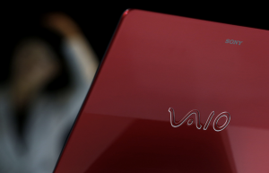
BMW
BMW’s logo colors come from the Bavarian flag, which are blue and white. Their logo is derived from the Rapp Motor Works’ logo, which is very similar. It is commonly thought that the logo represents the blades of a spinning propeller, due to their aviation history and an ad created in the 1920s.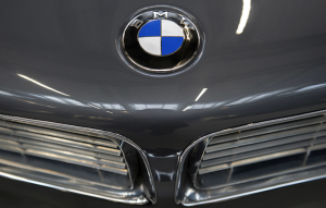
LG
LG is recognized worldwide, and most people recognize the ‘L’ and ‘G’ in the logo mark. What most people don’t realize, though, is that those letters actually help to create a face. The ‘L’ makes the nose and the ‘G’ makes up the rest of the face. This gives the brand a human element, and makes it more inviting and approachable.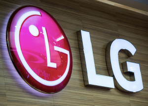
TOBLERONE
The popular chocolate bar, Toblerone, has been around for quite some time. Its current logo features a mountain, symbolizing the Matterhorn Mountain in Switzerland. Hidden inside the mountain is a bear, symbolizing the unique honey flavor found in the chocolate and the fact that the chocolate is made in the ‘City of Bears’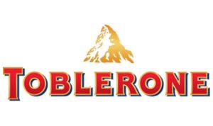
AUDI
Another car company with a logo with a hidden meaning is Audi. The Audi emblem with its four rings identifies one of Germany’s oldest-established automobile manufacturers. It symbolizes the amalgamation in 1932 of four previously independent motor-vehicle manufacturers: Audi, DKW, Horch and Wanderer. These companies form the roots of what is today AUDI AG.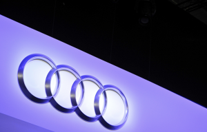
Pinterest got its name sake from the idea of ‘pinning’ things you like to a board. To further the idea of the pin, the ‘P’ represents a pushpin. This brings together the real life aspect of tacking something to your wall and also doing it in the digital age.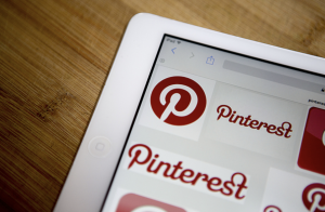
Many small business owners spend weeks coming up with a business plan and days inventing the perfect company name, but another key element in marketing your brand is your logo. A logo is a visual representation that appears on company signs, paper and advertisements that customers use to identify your company.


